 , fast delivery, and backed by our world-class customer service every step of the way.
  1-800-881-6093
 Back
Back
How to Design Mailer Boxes That Look Like a Real Brand
Design mailer boxes that customers remember by locking in a focused workflow: pick your dieline, build artwork to spec, order a physical sample, then approve full production. Skip any of those four steps and you're gambling on a box that either misprints, ships too loose, or arrives looking nothing like your screen preview.
The fastest path from concept to finished carton comes down to three decisions: use a live 3D preview so you catch layout problems before you pay for anything, choose the flute or board weight that actually protects your product, and pick finishes that fit your budget instead of your Pinterest board. Get those three right and everything else in this guide is refinement.
Here's the checklist to start right now:
- Measure your product (with any tissue or insert) to lock interior dimensions.
- Download the vendor's dieline template before opening your design software.
- Build artwork in CMYK at 300 DPI with a 1/4" bleed margin on every panel.
- Order one printed sample or a digital proof before you approve a full run.
- Confirm your finish (matte, gloss, SuperGloss) matches your brand's price point.
- Start with the size and structure.
- Build to the dieline, not a guess.
- Proof it. Then order.
Pro Tip: If colors are important to you, never approve a full production run off a screen preview alone. Monitors render color warmer or cooler than a press does, and a $35 sample (plus $6.25 shipping) can save you from a $2,000 misprint.
A vendor that offers an online 3D configurator, a free art-review process before printing, and low minimums for short runs removes most of the risk from this workflow, which is exactly why that combination has become the standard for small and mid-sized brands ordering mailer boxes online.
Key Takeaways
Designing a mailer box that performs requires a correct dieline, CMYK artwork at 300 DPI with proper bleed, a physical sample check, and a vendor workflow that includes 3D preview and art-review before production.
| Point | Details |
|---|---|
| Build to the dieline first | Open the vendor's template before designing anything to avoid text landing on folds or seams. |
| Use CMYK, not RGB | Set artwork to CMYK at 300 DPI with a 1/4" bleed to prevent color shifts and trimmed edges. |
| Match flute to product weight | Choose our standard E-flute for most items, or request B-flute as a special order for heavier goods that need extra cushioning. |
| Always order a sample first | Approve a physical sample or digital proof before committing to a full production run. |
| Prioritize sustainability | Choose FSC-certified or recycled stock if eco-positioning matters to your customers, otherwise focus budget on finish quality. |
| Use a low-minimum platform | Packwire's 3D configurator, low minimums, and free art-review process reduce reprint risk for SMB orders. |
Step-by-step: how to design a mailer box
Designing a mailer box is not one task. It's a sequence, and skipping steps out of order is where most first-time brand owners lose weeks to reprints. Here's the order that actually works, whether you're using a template supplied by a vendor or building from scratch.
- Define your brand foundation first. Decide which panel carries your logo (usually the lid), which carries your story or ingredient list (interior lid or a side panel), and which stays clean for shipping labels. Trying to cram your entire brand story onto every panel is how mailer boxes end up looking cluttered.
- Measure your product and set interior dimensions. Add a buffer for tissue, inserts, or padding, generally an extra 0.25 to 0.5 inches per side depending on how snug you want the fit. Too tight and the lid won't close cleanly; too loose and the product shifts in transit.
- Download and lock the vendor's dieline (or skip the guesswork with our 3D configurator). A dieline is the flat, unfolded template that shows exactly where the box folds, cuts, and glues, and it's non-negotiable. Designing flat without one means guessing where your text will land relative to a fold line. To make this foolproof, you can upload your artwork directly into Packwire's 3D configurator. Instead of trying to visualize a flat layout, you get a live, 3D rotating model that instantly shows if your text straddles a fold, if your edges bleed correctly, or if a logo is upside down, saving you hours of trial and error.
- Set up your artwork file correctly. Work in CMYK, not RGB, since RGB colors shift unpredictably once they hit a printing press. Build everything at 300 DPI minimum, and include a 1/4" bleed margin around every panel so trimmed edges never expose white board. Designing to the dieline at this resolution and bleed is the single biggest factor separating clean production runs from expensive do-overs.
- Export the right file type. Submit a press-ready PDF, or native .AI/.EPS files if your vendor accepts them. Convert every font to outlines before export (fonts that aren't outlined can reflow or substitute on someone else's system) and embed all linked images rather than leaving them referenced externally.
- Order a sample or short proof run. Before you commit to your full quantity, get a physical sample or a digital art-review proof. This is the step brand managers skip when they're in a rush, and it's the one that catches color drift, sizing errors, and finish mismatches before they're baked into 2,000 units.
- Keep text at least 0.25 inches from any fold or trim line (a "safe zone" your vendor's template should mark clearly).
- Use vector logos wherever possible instead of low-resolution rasters.
- Double-check your Pantone or CMYK values against a physical swatch, not just your screen.
Pro Tip: If your brand uses a specific Pantone color for its logo, ask whether your vendor supports spot color printing. Digital CMYK is faster and cheaper, but it can't always hit an exact PMS match the way spot printing does.
What size and structure should your mailer box be?
The right mailer box size isn't the one that looks best in a mockup. It's the one that holds your product snugly enough to prevent shifting without adding so much extra volume that you're paying to ship air.
Start with your product's actual footprint, then add allowance for padding. A general rule: add 0.25 to 0.5 inches of interior clearance per dimension if you're using tissue paper or a thin insert, and closer to 1 inch if you're packing foam or corrugated dividers. Too little clearance and the lid strains against the contents; too much and your product rattles around during transit, which is how cosmetics arrive cracked and apparel arrives wrinkled.
Structurally, most e-commerce brands land on one of two styles:
- Self-locking front-tuck mailers fold flat for storage, assemble without tape or glue, and lock shut with interlocking flaps. These dominate subscription boxes and apparel because they're fast to pack and look intentional the moment the flap pops open.
- Other tuck styles (reverse tuck, seal-end) suit heavier or bulkier items where a locking tab isn't enough security, or where you want a fully enclosed carton rather than an open-lid presentation.
If your product has multiple components, a foam insert, molded pulp tray, or die-cut cardboard divider keeps each piece from colliding with the others. Compartments also do double duty: they make a $20 product feel considered rather than just dropped in a box.
| Product type | Suggested interior size range | Recommended structure |
|---|---|---|
| Cosmetics or skincare set | 6" x 4" x 2" to 9" x 6" x 3" | Front-tuck mailer with die-cut insert |
| Apparel (folded shirt/hoodie) | 10" x 8" x 2" to 14" x 10" x 4" | Front-tuck mailer, tissue wrap |
| Subscription box (mixed items) | 8" x 6" x 3" to 12" x 9" x 4" | Front-tuck mailer with compartment insert |
| Jewelry or small accessories | 3" x 3" x 1" to 7" x 5" x 2" | Front-tuck mailer with foam or pulp tray |
| Electronics or fragile goods | 7" x 5" x 2" to 10" x 8" x 4" | Reverse tuck with corrugated divider |
A box size optimizer can shortcut a lot of this trial and error by calculating dimensional weight against your product's footprint, which matters more than most brand managers realize once shipping carriers start charging by volume instead of just actual weight.
Which materials, printing methods, and finishes fit your brand and budget?
Your material choice determines both how your box survives shipping and how much your printing options cost, so it's worth understanding the trade-offs before you fall in love with a finish you saw on a competitor's unboxing video.
Substrates. E Flute White Board gives you the cleanest surface for vibrant, high-resolution printing and is the default for cosmetics and premium goods. E Flute SuperGloss (Kemi) Board provides an ultra-shiny surface that makes photography and bold colors pop brilliantly. E Flute Kraft Board carries a natural brown tone that pairs well with an eco-forward brand story, though it prints slightly duller since ink sits differently on the uncoated surface. Our standard offering across these boards is E-flute, which perfectly suits lightweight items like cosmetics, apparel, and jewelry. If your products are heavier or more fragile and need real cushioning, B-flute is available as a special request across all three board types. If you're unsure which substrate or flute your product needs, ordering a sample is worth the small upfront cost.
Printing. Digital CMYK printing is the standard for short runs and delivers strong color accuracy for most brand palettes. If your logo relies on one exact color (a specific brand blue, for example), ask about spot or PMS printing, since CMYK approximates colors through four-ink combinations and can shift slightly from what you see on screen.
Finishes. Matte finishes read as premium and offer an elegant, non-reflective look. SuperGloss creates high-impact shine and durability. Premium mailer boxes frequently combine interior printing and matte finishes to create that "this cost more than it did" unboxing moment, but each finish adds cost and typically extends production time.
Sustainability. FSC certification is a recognized third-party standard for responsibly sourced wood and fiber packaging, and it is becoming a real purchasing signal for eco-conscious customers, not just a nice-to-have footnote. Recycled board stock and recyclable, single-material construction (skipping laminates that can't be recycled) are the two easiest sustainability wins if that's part of your brand story. If you want more ideas specific to eco-conscious presentation, The Cork Store's guide to environmentally friendly packaging covers material alternatives worth considering alongside your board choice.
| Option | Cost impact | Best for |
|---|---|---|
| E Flute White Board | Moderate | Cosmetics, premium retail |
| E Flute Kraft Board | Low to moderate | Eco or artisanal branding |
| E Flute SuperGloss (Kemi) | Moderate to high | Vibrant colors, high-impact retail |
| B-Flute (Special Request) | Moderate | Heavier or fragile products |
Sustainability is no longer a fringe request. Citing FSC certification or recycled content directly influences purchasing decisions among buyers who weigh environmental impact alongside price and design.
Which add-ons actually improve the unboxing?
Not every add-on earns its cost. Some deliver a disproportionate brand lift for pennies; others add expense without the customer noticing at all.
- Inserts. Die-cut cardboard inserts are the cheapest way to organize multiple items and prevent shifting. Molded pulp trays look and feel more premium, often used for cosmetics and electronics. Foam inserts protect fragile or oddly shaped items best. Corrugated dividers work well for multi-SKU subscription boxes where compartments matter more than cushioning.
- Branding touches. Tissue paper in a brand color, a single sticker sealing the tissue, a printed thank-you card, or branded tape across the shipping carton all add recognition at minimal per-unit cost.
- Functional features. Tear strips and perforations make opening faster and feel more considered than a box a customer has to fight with scissors to open. Security seals and tamper-evident closures matter more for cosmetics, supplements, or anything regulated.
- Interior printing. A full-color interior lid print or a color-blocked interior reveal is one of the highest-impact, lowest-cost upgrades available, since it's the first thing a customer sees when the flap opens.
If you want a deeper breakdown of insert types and where they fit specific product categories, Packwire's guide to packaging inserts walks through the options in more detail.
Pro Tip: If your budget only stretches to one upgrade, choose interior printing over an insert. A colorful interior costs less than most insert types and creates the biggest visual surprise per dollar spent.
Where should you actually put your budget? Interior printing and a single branded sticker tend to deliver the most noticeable brand lift for the smallest incremental cost. Foam inserts and specialty finishes cost significantly more and matter most when your product's retail price already justifies a luxury unboxing experience.
What drives price, minimums, and turnaround time?
Four variables move your price per unit more than anything else: quantity, size, substrate, and finish count. Order more units and your per-unit cost drops because setup costs (plates, tooling, dieline cutting) get spread across a larger run. Bigger boxes use more board and cost more to ship to you before you've even shipped a single order. Every additional finish (such as an extra ink color) adds a separate production pass, and each pass adds cost.
Digital printing workflows are what make low minimum order quantities possible in the first place. Offset printing requires physical plates that only make financial sense at higher volumes, which is why traditional print runs historically demanded thousands of units. Digital presses skip that step, letting vendors offer runs in the dozens or low hundreds without pricing small businesses out entirely.
Typical production timelines run in stages: proof and approval (usually a day or two once artwork is submitted correctly), then production, then shipping. Standard production lead times commonly fall in the 7 to 15 business day range once a proof is approved, with expedited options available at most vendors for launches that can't wait.
To bring cost down without gutting your design, focus on the levers that don't touch your brand impact:
- The best trick here is to either print the inside or outside as printing both sides really increases pricing.
- Limit specialty finishes to one accent rather than layering multiple effects.
- Reduce print zones if you don't need full coverage on every panel.
- Order your sample and full run together when your timeline allows it, since separate sample orders can add lead time.
Prices vary by vendor and specification, so get an instant quote through your chosen platform's configurator before committing to a print method.
What happens when you order a mailer box online?
Most vendor platforms follow a similar sequence, and knowing what's coming next means you won't be caught off guard mid-order.
- Configure your box. Select a standard size or enter custom dimensions, then choose your substrate and finish options.
- Upload artwork or start from a template. If you don't have a design finalized, most platforms offer downloadable templates matched to their dielines.
- Review a live 3D preview. This is where you catch layout problems, like a logo that lands too close to a fold, before anything goes to print.
- Submit for online proofing or art-review. A vendor's prepress team checks your file for bleed, resolution, and color mode issues that could cause problems on press.
- Approve a sample or digital proof. Confirm color, fit, and finish match expectations.
- Checkout and confirm production. Once approved, your order enters the production queue.
Before you approve anything, verify these specifically in the preview:
- Trim lines and bleed extend correctly on every panel.
- Text sits inside the safe zone, not touching a fold or trim edge.
- Color panels match your intended Pantone or CMYK values.
- Logo placement reads correctly on all visible faces, including the interior if you're printing there.
A free online proof and art-review step reduces reprints significantly, since a second set of trained eyes catches resolution and color-mode errors before they hit press, which is exactly why platforms that build this step into checkout tend to have fewer post-production complaints.
Pro Tip: When you contact customer support before ordering, ask specifically about turnaround time for your exact quantity and finish combination, not just their general "standard lead time" quote. Specialty finishes almost always add days that generic FAQ pages don't mention.
If you're shipping at real volume, ask what fulfillment options exist beyond just delivering boxes to your door. Many packaging vendors integrate with platforms like Shopify for order syncing, and fulfillment partners such as ShipBob offer warehousing and dropship workflows that connect directly to custom packaging suppliers, which matters if you're trying to avoid storing pallets of boxes in your own garage.
Design inspiration: what works for different product types
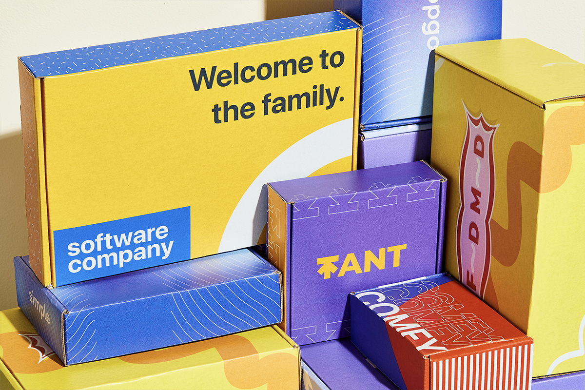
A subscription box benefits from a strong lid graphic since that's the first image a customer photographs for social media, paired with an interior reveal that changes seasonally to keep repeat customers curious. A skincare or cosmetics kit tends to perform best with a clean white or matte exterior and a fitted insert that holds each product in place, since fragile glass bottles shifting in transit is the single most common damage complaint in that category. Apparel orders lean into full-wrap photography or a bold two-color kraft look, since the box often doubles as a return mailer and needs to survive a second trip. A sample or PR kit going to press or influencers should prioritize an unboxing sequence, tissue, a handwritten-style card, maybe a QR code linking to a brand story, since the entire point is generating a shareable reaction.
A simple interior print or a single well-placed sticker can create a brand impression disproportionate to its cost, often outperforming a much more expensive structural upgrade in terms of the reaction it gets on camera.
Templates matter more than most first-time designers expect. Starting from a vendor-supplied dieline template means your fold lines, bleed zones, and safe areas are already mapped, so you're designing within known constraints instead of guessing where a panel will land once it's die-cut. Two visual approaches consistently perform well across categories: a two-color kraft look with a single bold accent ink, and a full-wrap photographic exterior paired with a color-blocked interior reveal. Iterating between the two inside a live 3D configurator, rather than mocking up flat comps in design software, lets you actually see how a color choice looks once the box folds into shape.
Why Packwire makes designing and ordering mailer boxes easier
Packwire built its platform around the exact friction points this guide has covered: unclear sizing, guesswork on color, and the fear of committing to a bulk order before seeing a real preview. The platform's 3D configurator lets you build your box, drop in artwork, and rotate a live render before you spend a dollar on production.
- Instant pricing as you adjust size, substrate, and quantity, so you can see budget impact in real time instead of waiting on a quote email.
- Low minimum order quantities, which means testing a new box design or a seasonal variant doesnt require committing to thousands of units.
- Press-ready dielines matched to each box style, removing the guesswork of building a template from scratch.
- A dedicated art-review process where Packwire checks your file for bleed, resolution, and color-mode issues before anything goes to press.
The workflow runs config, then proof, then sample, then production. That order matters: catching a layout issue in the 3D configurator costs you nothing, catching it in a proof costs a few minutes, and catching it after a full production run costs real money and weeks of delay. Packwire's mailer box configurator is built specifically to catch problems at the cheapest possible stage.
Pro Tip: Run your artwork through the 3D preview at every major revision, not just at the end. Small text and thin lines that look fine flat can disappear once a panel folds at an angle.
Reducing approval cycles isn't just about speed. Every round of back-and-forth on a proof is a round where your launch date slips, and for a seasonal product, that slippage can mean missing the window entirely.
Packwire works with both SMBs ordering their first branded run and larger operations that need full-color mailer options at scale, which is part of why the platform has earned trust from businesses ranging from independent e-commerce brands to Fortune 500 companies.
What mistakes should you avoid when designing a mailer box?
The same handful of mistakes show up again and again in first-time mailer box orders, and every one of them is avoidable once you know to look for it.
Designing in RGB instead of CMYK tops the list. RGB is built for screens, not ink, and colors that look vibrant on a monitor often print duller or shift hue entirely once translated to a four-color press. Ignoring the dieline is a close second: designers who build flat artwork without referencing where folds and trims actually land end up with logos that split across a seam or text that vanishes into a glue flap. Skipping the sample order to save a few days is the mistake that costs the most in the end, since color, finish, and fit problems that would have been caught on a $35 sample instead show up across an entire production run.
Other recurring errors: forgetting bleed entirely (leaving a thin white sliver at the trim edge), using low-resolution logos that turn blurry or pixelated once scaled to a full panel, and over-designing every surface instead of leaving breathing room. A box covered edge-to-edge in text and graphics reads as cluttered no matter how good the individual elements are. Finally, ordering the wrong flute weight for a heavy product is a mistake that only shows up after a customer complains about a crushed box, well after the run is already shipped.
An editorial take on packaging mistakes
File prep is where most mailer box projects go sideways, and it's rarely a design problem. It's a discipline problem. Designers who are used to building for web or social media default to RGB out of habit, and that single setting choice causes more reprint headaches than any structural or material decision in this entire guide.
The dieline gets treated as an afterthought more often than it should. Some designers finalize their layout first, then try to force it onto the template afterward, which is backward. The dieline should be the first file open, not the last one checked. Every fold line and glue flap is a hard constraint, not a suggestion, and text that ignores that constraint gets folded into a seam or trimmed off entirely.
Skipping the physical sample is the most frustrating mistake to see, mostly because it's the easiest one to prevent. A sample costs a fraction of a full run and catches exactly the problems that are invisible on a screen: how a premium finish actually feels, whether a kraft board's natural texture mutes a color more than expected, whether a self-locking mailer actually locks shut on the first try. Skipping that step to save a week almost always costs more than a week once a full run comes back wrong.
Pro Tip: Test your color and finish combination on the same substrate you're ordering, not a generic swatch. A matte finish over E Flute Kraft reads noticeably different than matte over E Flute White Board, and that difference doesn't show up until you're holding both in your hand.
If you want to see how this plays out on a real product line, Packwire's packaging trends breakdown covers why mailer boxes have become the default format for e-commerce brands that used to rely on plain corrugated shippers.
Ready to design your mailer box? Here's the fastest way to start
You've got the workflow, the material trade-offs, and the mistakes to avoid. The fastest way to put all of it into action is Packwire's 3D configurator, where you build your box, drop in your artwork, and see a live render before committing to a print run. Low minimums mean you can test a design with a short run instead of gambling on thousands of units, and every order runs through a free art-review process before anything hits production, so bleed, resolution, and color issues get caught before they become a reprint.
Start by configuring your size and uploading your artwork or a dieline-matched template, then request a sample to confirm fit, color, and finish. If it holds up in your hands the way it did on screen, move straight to your full order with confidence that what you approved is exactly what arrives at your customers' doors.